Presentation - Icing on the CakeBy Sam Tarrel, M.Photog.M.Artist.Cr., CPP, DFP-OR |
The icing on the cake has always been a reference used to describe that little extra bit of goodness an item or given situation may have. I think we can all agree that cake is usually pretty good, but having that icing really puts it over the edge as far as sweet indulgences go. The same thing applies to one of the most overlooked elements in image competition: Presentation.
Presentation is one of those elements that many people, particularly newer competitors, don’t understand. This lack of understanding usually leads to frustration, which usually leads to dismissal. However, while dismissing this seemingly innocuous little twelfth element may not make or break an image, it certainly does not HELP an image.
The goal with any presentation is to enhance an image and its strengths, while not distracting from the image or exposing weaknesses in it. The rule of thumb to achieve this can be summed up in one word: Subtlety.
All presentations need to be subtle, and save for rare occasions, a bold, in-your-face presentation will usually do nothing but hurt what could otherwise be a great image! This subtlety comes in two forms:
1. The size of the mat and keyline
2. The color of the mat and keyline.
First, it might be helpful to understand exactly what a mat and keyline are. By definition, a mat is a piece of material placed over or under a photograph to serve as a frame, or provide a border between the picture and the frame. A keyline is defined as a yellow lime with a bitter rather than sour taste . . . . oh wait, no no no – that’s a key LIME. A keyline, in graphic design, is a boundary line that separates color and monochromatic areas or differently colored areas.
So, does size matter? For image competition, I would certainly say, yes! When it comes to the size of the mat, this can vary depending on the feel you’re trying to convey through the image. If you have an image that you’re trying to convey space, uncertainty, inadequateness, being small or insignificant then a larger mat may be a great tool to help enhance those feelings within an image. If the opposite were your goal however, where you wanted to give a feeling of grandeur, confidence, size and intensity, then a smaller mat may be a great choice to help enhance that!
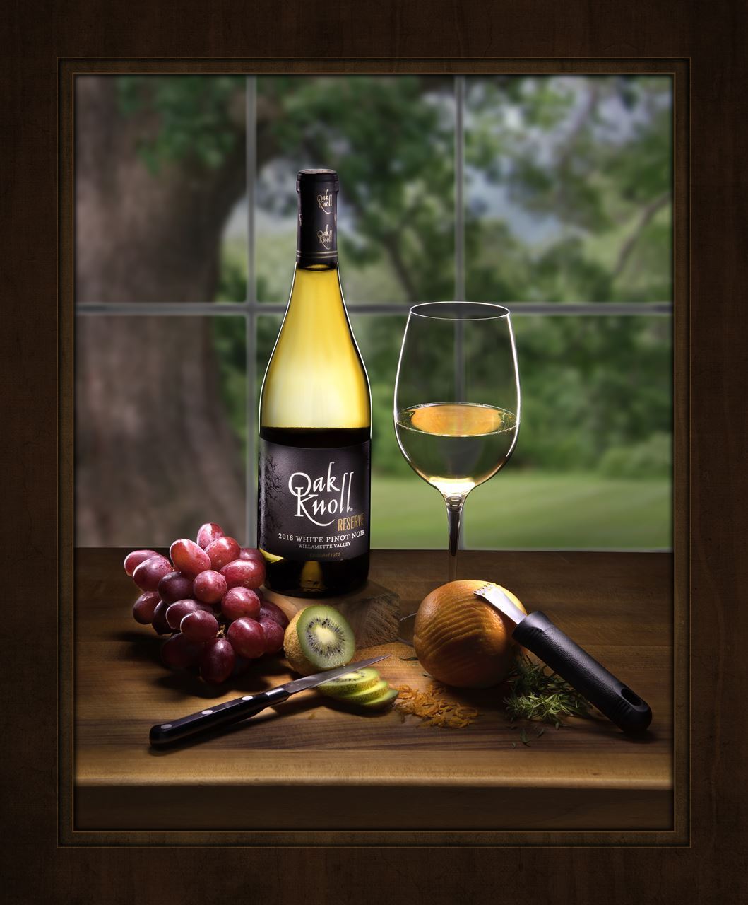
As a standard though, a mat shouldn’t be too big or too small (insert Goldilocks reference here). The image below has a very “standard” sized mat, and you will notice that it doesn’t exactly enhance any feature of the image itself, but simply provides a nice frame for which the image to exist in.

You’ll also notice how thin the size of the keyline is. A thin keyline, and in this case, a double keyline should serve to simply give finality to the world within which the image exists. It shows us where the image starts, and where it stops. If the image to the left didn’t have a keyline, it would look as if the subjects were just cut in half and disappeared from the waist down. By having the keyline there, it tells the viewer that there is more to this world that we just cannot see, and helps keep the eye in the image where it belongs. However, if the size of the keyline were much larger, as pictured in the image below, it begins to draw our eye to the line itself, and take us out of the image, which is the opposite of what a properly done keyline should do.
When it comes to color choices of mats and  keylines, both should be colors sampled from within the image, but the mat in particular should almost act as an extension of the image itself. This certainly isn’t always the case, but a good mat color is one that is predominant usually in the background elements of the image. It’s also important to keep the mat and keylines “in key” with the image. For most images that are mid to low-key, this means your mat should be sampled from a darker area of the image. If the image is a high-key image, then the opposite would be true, and you would want to sample from a brighter point in the image for the mat color.
 When choosing a keyline color, it should be something that isn’t far off from the mat color. Often times keeping the color the same, and simply choosing a slightly brighter, or in the case of a high-key image - a darker color, for the keyline is the best course of action. Notice in the image to the left, we have a double mat along with a keyline, but the colors that make up all three are very similar with just a slight variance in tonality.
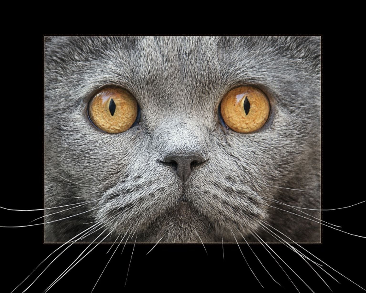
Of course, as with all “rules” there are exceptions, and the rules I’ve stated up to this point are no different. Sometimes there can be a very creative approach to a presentation that does draw the attention of the viewer, but does it intentionally in a way that enhances the experience of the image. The image to the right makes use of a presentation where the cat’s whiskers break the confines of the keyline, thereby making the cat seem to be bursting out of the frame.
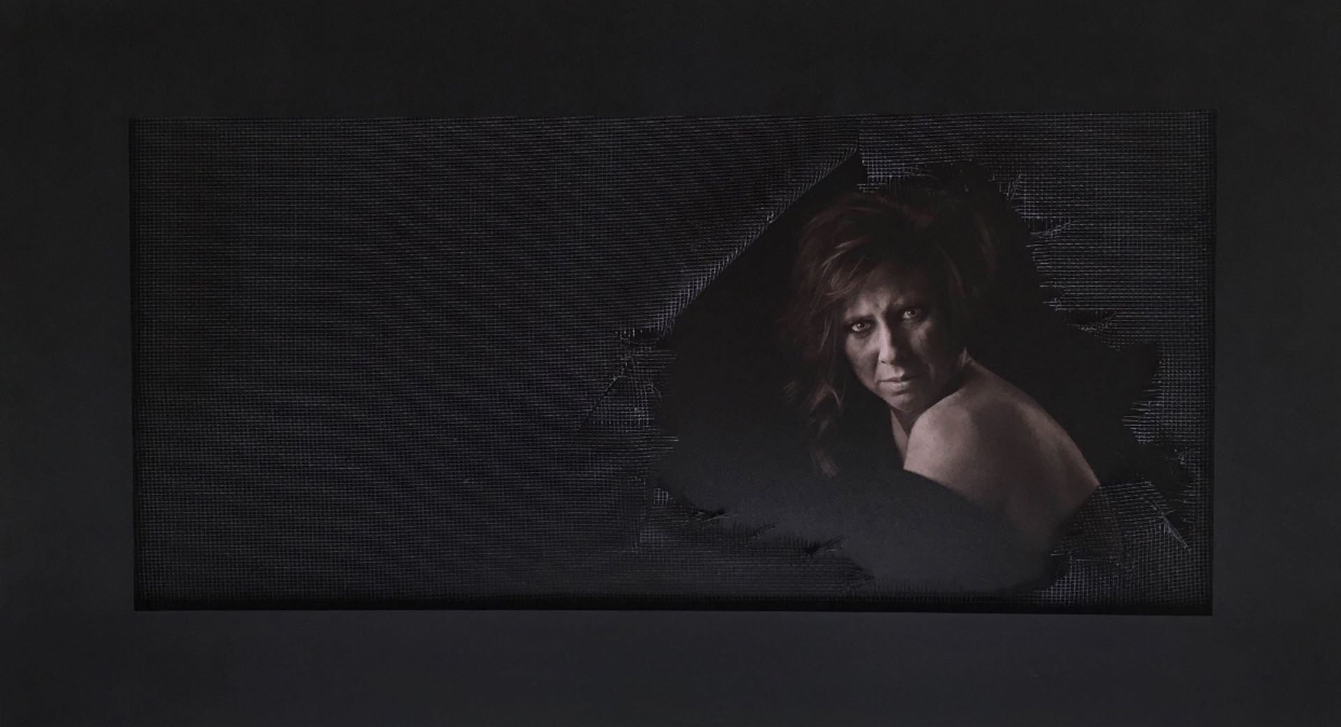
This next image was actually a physical print in which the maker decided to use a wire mesh screen as a part of her presentation. This added an extra layer of depth and realism to the image, which not only helped tell the story of the image, but also gave extra points for IMPACT!
Ultimately, when it comes to presentation, the key is always to enhance the image while never becoming distracting or detracting from the image. A quality image should certainly have the fortitude to stand on its own and embody many of the other 12 elements, but just like with cake, a good image will always benefit from a little icing on top!
To learn how to create a mat:


Sam Tarrel is a Fine Art Portrait and Commercial photographer in Hillsboro, Oregon. Sam is the owner of Light Science Studios. Sam is extremely active in image competition and his passion for photography is rivaled only by his passion for teaching and educating others. His ultimate goal is always to help each student achieve the most they can in their craft. He is very active in the Oregon PPA and holds his Certification with PPA. He is an informative and engaging instructor, committed to his industry and colleagues, and his students always come away with a greater understanding and confidence in their work after working with him.
| Professional Photographers of Sacramento Valley |